Greenbeanz Photography
5 editing decisions that can transform your photographs | Outside of the frame | Photography Blog
5 Editing Decisions That Can Transform Your Photographs | Outside of the frame | Photography Blog | Greenbeanz Photography | July 12th 2019
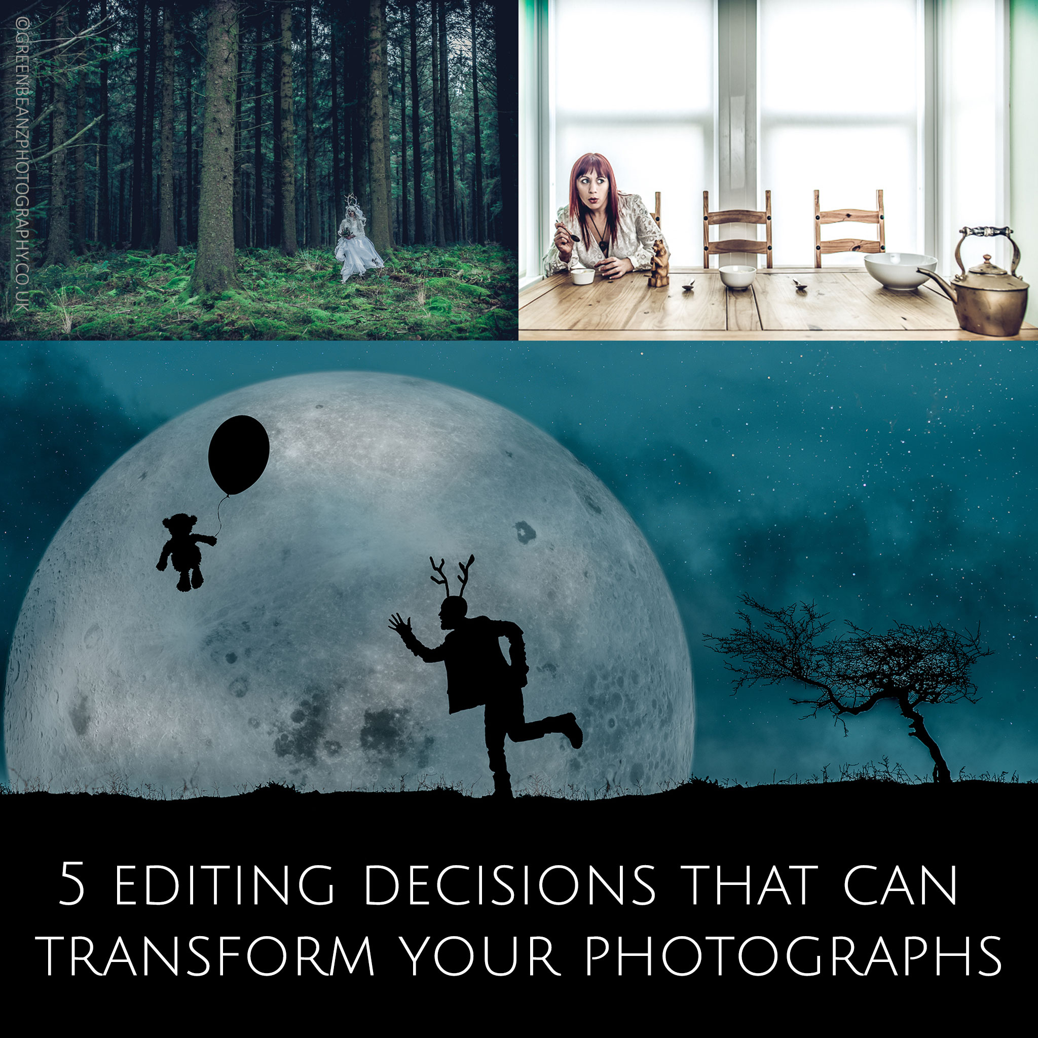 ABOVE : Three very different approaches to telling a story. Your photographs can convey a story but your editing decisions can influence how you present that narrative
In a world in which the tyranny of choice can paradoxically paralyse us into a state of inaction it can be useful to narrow down as a starting point , those editing decisions that can really transform your photographs. Figure out what you want to achieve with the image. Not just what story it is telling, but also the context that story will be viewed in. Array these options and factor in which editing decisions will help you achieve what you want. This is your goal after all, to match your vision with an audience and reward their attention with something they may not have seen. Your photograph is made not by the daft and pretentious illusion of painting with light, but something much more akin to tracing and drawing (graph) a representation of an already edited, slice of time restrained by the boundaries of a frame and the time in which it was made. Editing that photograph extends the time in which it is made, so use that time wisely to show us what 'YOU' saw.
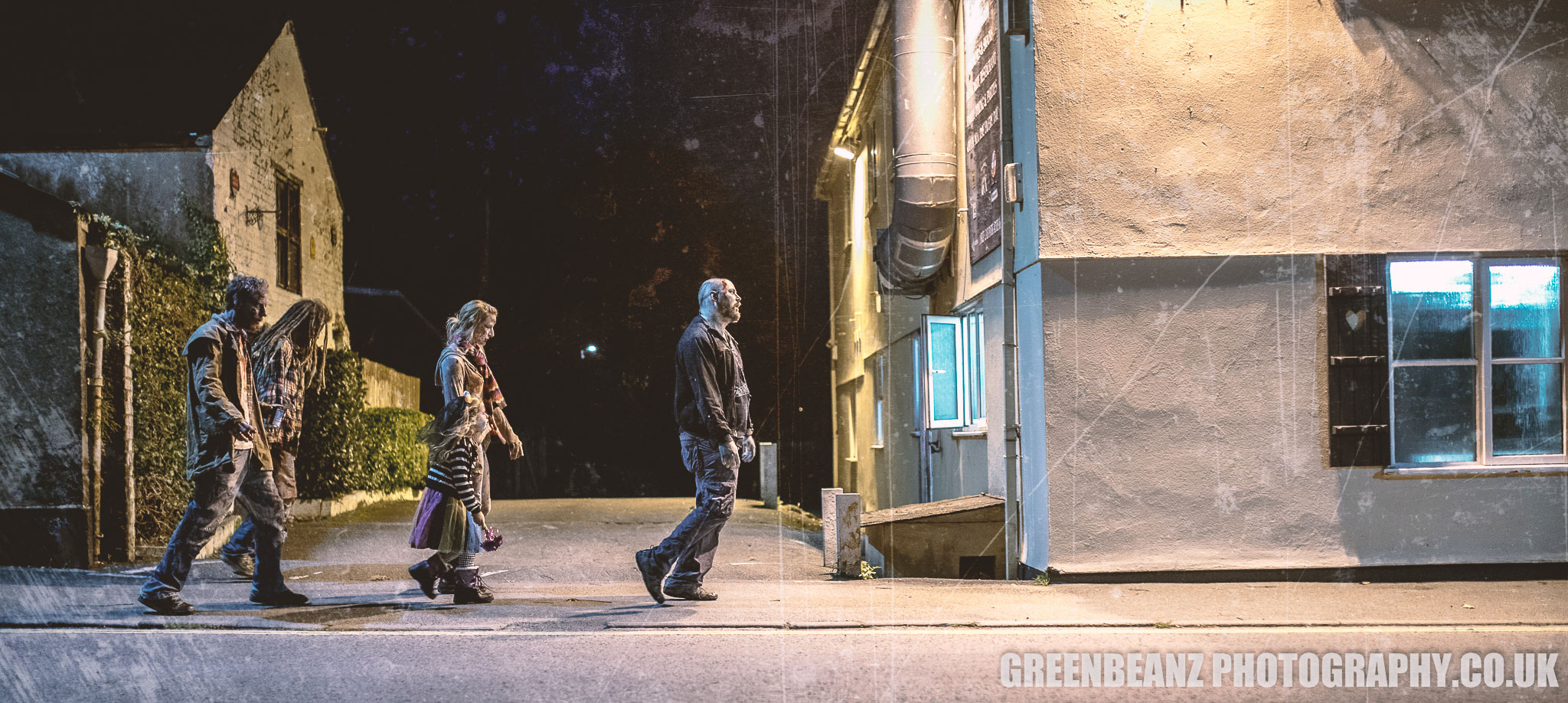 ABOVE : A wide crop can provide a space across which your protagonists can travel, expressing both the passage of time and a literal journey. In this case the cinematic overtones of the ratio really suit the feel of the Ivybridge Zombie Walk.
1.GO WIDE OR GO HOME
Don't restrict yourself to 3:2 formats. The chances are your camera sensor has more than enough resolution to support a 16:9 crop or wider and by using this you will be giving yourself a wider canvas on which to tell a story. I have used this technique almost habitually when photographing gigs with a wide lens. It means using your flash to balance the crowd with the on stage performers and then removing the distractions of air conditioners, lighting rigs and sometimes the bottom strip of images, but it tells the whole story of the show . Without an audience the performers are kind of static and unreal, and capturing the crowd puts the viewer right in there.
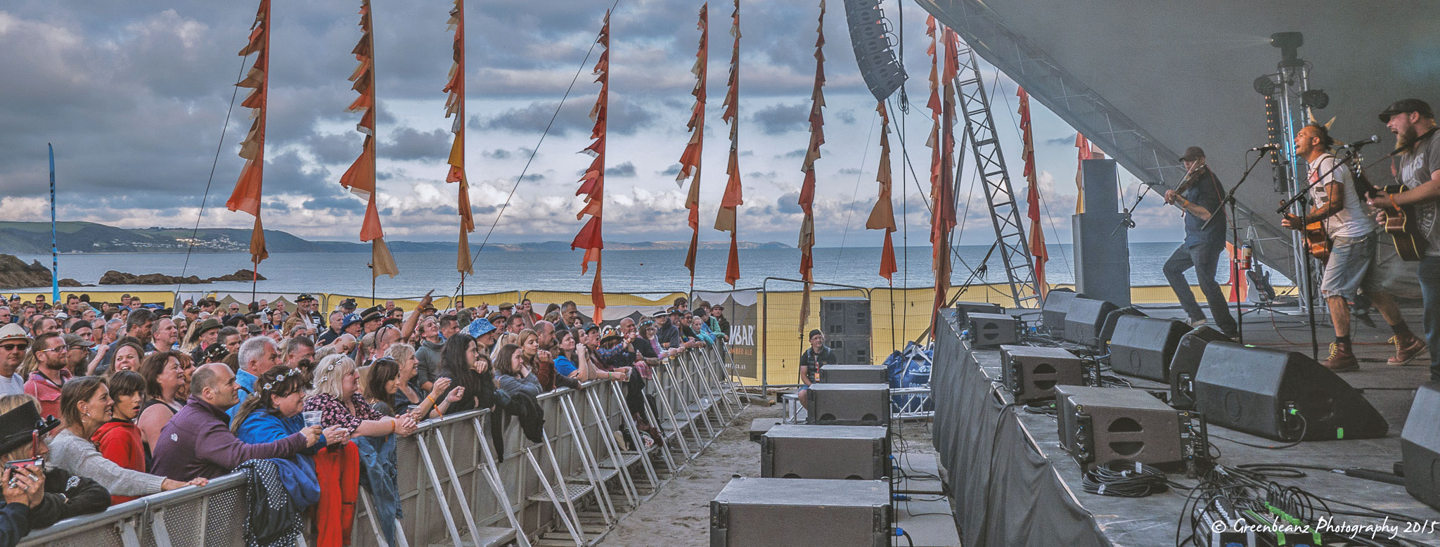 ABOVE : Ferocious Dog at Looe Festival in 2015. The wide crop here shows not only the band and their audience but also the magnificant backdrop of the sea and sky behind the beach on which the festival is held.
Don't restrict yourself to reserving wide images for panoramas or landscapes it is often a useful shorthand for nodding toward the cinematic when capturing the human drama of quite intimate events. There are often multiple little stories happening at events and the window of a wide crop provides a great letterbox thru which to watch all these little dramas unfold.
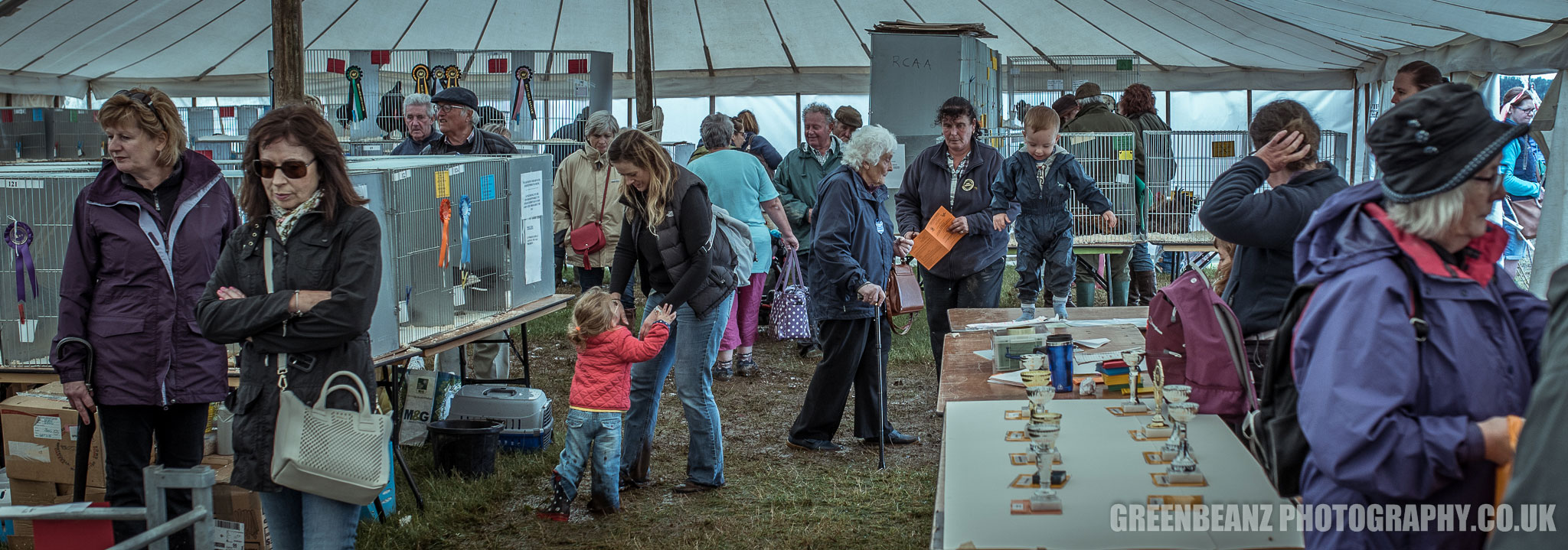 ABOVE: So many stories, so little time. Then go wide and open up the opportunity for the viewer to engage with more than one element of an image. The greater depth of field available with shorter focal lengths will help you.
When space is tight, which it often is at events where you are trying to remain unobtrusive, a wide angle lens is crucial in allowing you to fit everything in. Wide angle lenses come with their own distortion but cropping and editing tweaks can address this. So if you are shooting wide anyway why not shoot low to guide the viewer into the image and crop to exaggerate and celebrate this choice?
ABOVE : For Art Shows, Event Photography and Retrospectives like this celebration of 35 yrs of Spoken Word performances, the extra-wide crop can present the viewer with a sense of scale and perspective showing just how broad, all encompassing or comprehensive the event was.
2. BE CAREFUL WHAT YOU AMPUTATE
It should be no surprise that to crop often involves focusing on the head and face of a subject when the word itself often refers to the cutting off of the head of a plant at harvest. Just like the famer with a blade, as photographers we are often searching for heads and their faces to help sell a photo. We can't help responding to faces and so cropping in tight to a face can really help communicate with an audience. Especially at gigs when the stage is often full of clutter and distractions a telephoto close up of a performers face can help evoke a sense of the intensity of that performance .
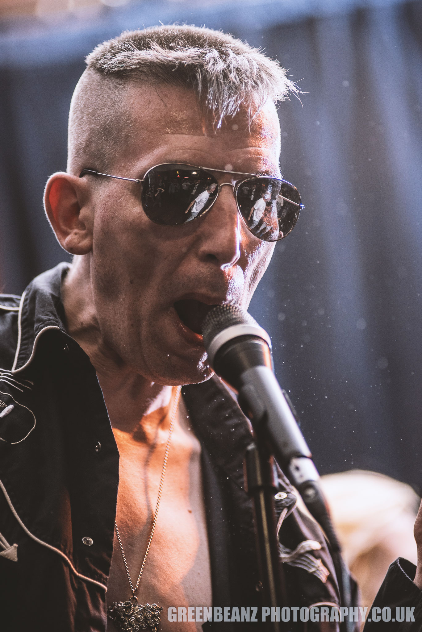 ABOVE : The closeup here showing the fans reflected in the sunglasses and the sweat flying benefits from a very tight crop conveying the intensity felt by those present at the gig
There is a lot said about the power of negative space in photography but often the most important element in an image can benefit from dominating the frame. It need not touch the edge but do not be afraid of getting close, that is why you were there, that is why you bought a telephoto lens to give others access they might not have otherwise had.
There are a few things to remember when copping people. Try to avoid chopping off limbs at the joint. Our brains will naturally try and look for the missing parts so crop above or below, rather then on the actual elbow, knee, wrist etc. Use your judgment and develop your style. (You can see from the image above that a little bit of a tighter crop on the left to remove the tantasling suggestion of a hand, which you can't actually see properly, might have improved it.)
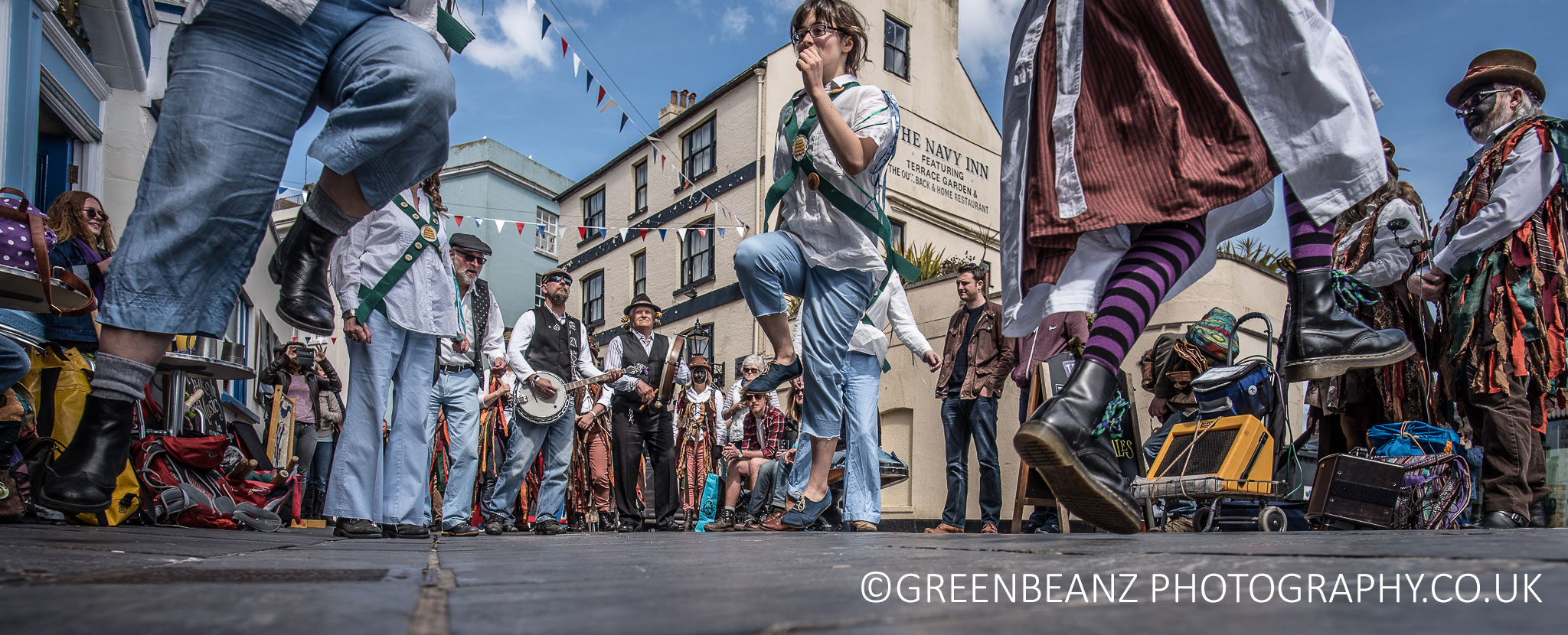 ABOVE : While the original image included the roofs and skyline it was much more important to focus the viewers attention on the energy of the Morris dancers and the rhythm of their feet leaving the floor.
Not just limbs. It can be just as important a decision to leave something in as it is to crop it out. I have lopped heads off when the focus is at ground level and removed left hands and headstocks when they distract, but only when it makes the image stronger. If the cropping decisions become the focus and look like mistakes, then sometimes you may have to include supporting elements or crop to different and novel ratios. Are you reintroducing boundaries that focus the eye, the viewers attention and increase the impact of the image, or are you removing crucial elements that would otherwise have made the image stronger? Don't be afraid to crop hard for impact
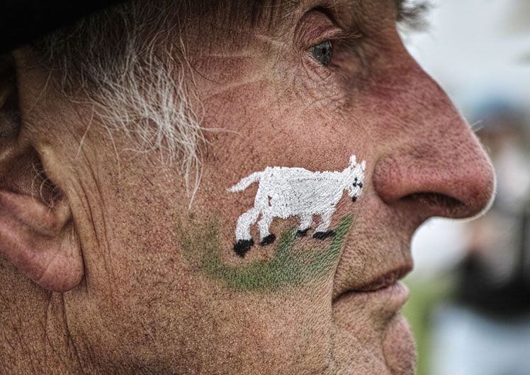 ABOVE : Close up of A Dartmoor Border Morris dancer from the same St Georges Day meet that Plymouth's Old Town Twelves above danced at. Sometimes a detail is crucial in establishing a supporting narrative.
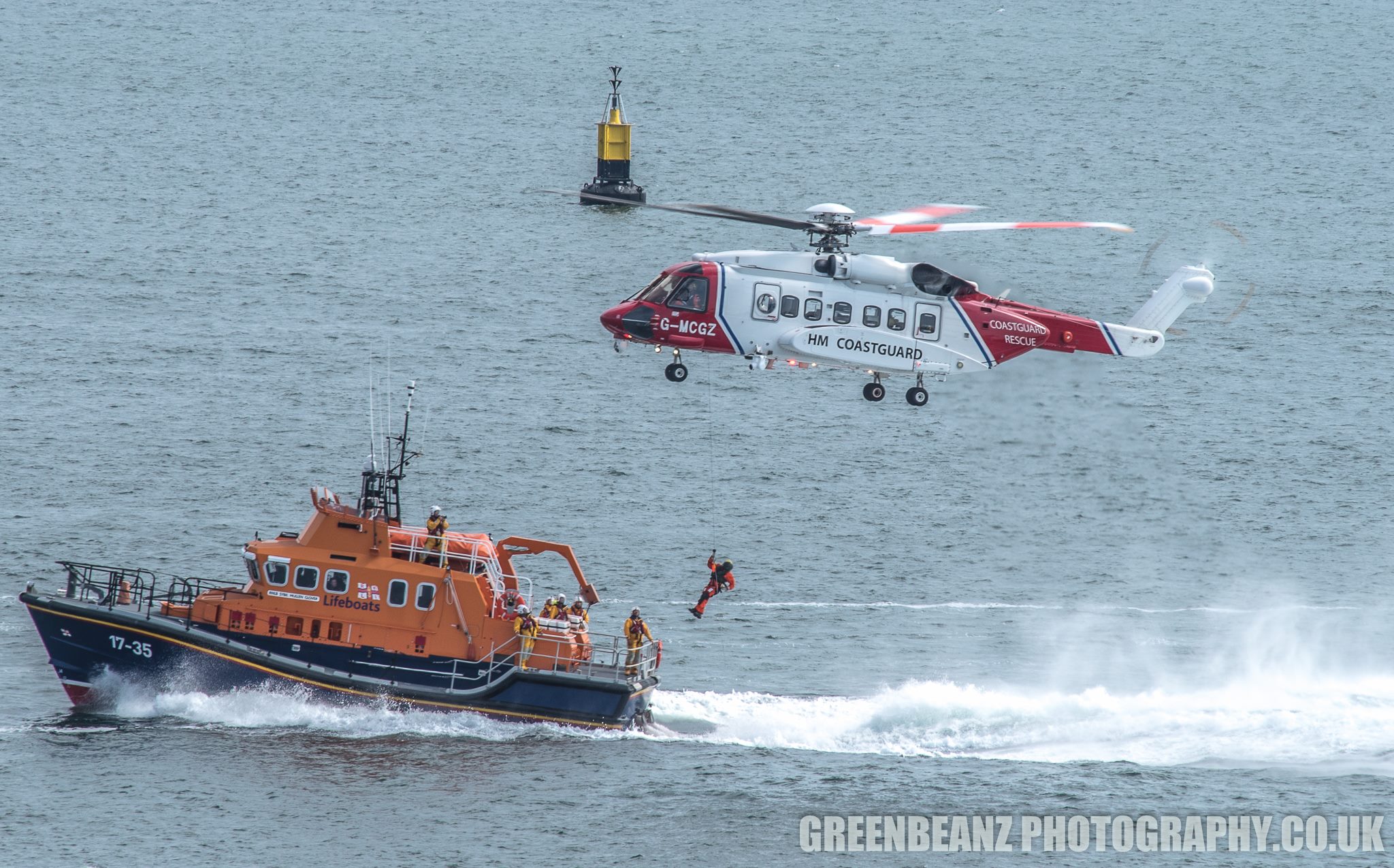 ABOVE : Be aware of cropping choices you may make in post production when shooting the original. Here the coastguard helicopter demonstration was shot with a long telephoto but still needed to be cropped closer. Ensuring in the rush to get a sharp photograph you do not raise the shutter speed too much and freeze the rotor blades above and on the tail of the aircraft is a tricky balancing act, but nowhere near as precarious as the window within which these guys are operationg.
3. SQUARE THAT CIRCLE
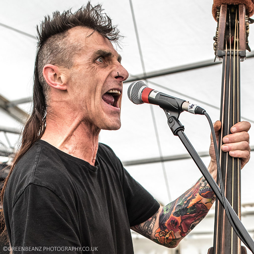 ABOVE : Andy from Psychobilly band Breakout may not seem the obvious choice for a square crop. Despite being an upright bass player (something that ususally requires a wide lens in portrait orientation) it is the intensity of Andy's performance that makes a square crop the right choice here. The image itself was mounted on an old LP cover for the 'Blinded by the Sound exhibition' and remains among my favourite gig shots ever.
I love square format images. Photography snobs and many event organisers will reject them but there is a venerable history of them outside 35mm photography and they are even being offered as a native in camera framing crop decision with cameras like the new Nikon D850. They work well not only as social media profile pictures but in online galleries and web pages and look lovely when printed and framed.
 ABOVE : Dionne in a classic square crop
It is not only instagram that utilises the ratio, any web page displaying your work as part of a grid will be enhanced with a series of square format images. They can even work on occasion when cropped as a circle for a profile photo by clients because the eye moves around a square much more naturally than a rectangle where it will usually read from left to right.
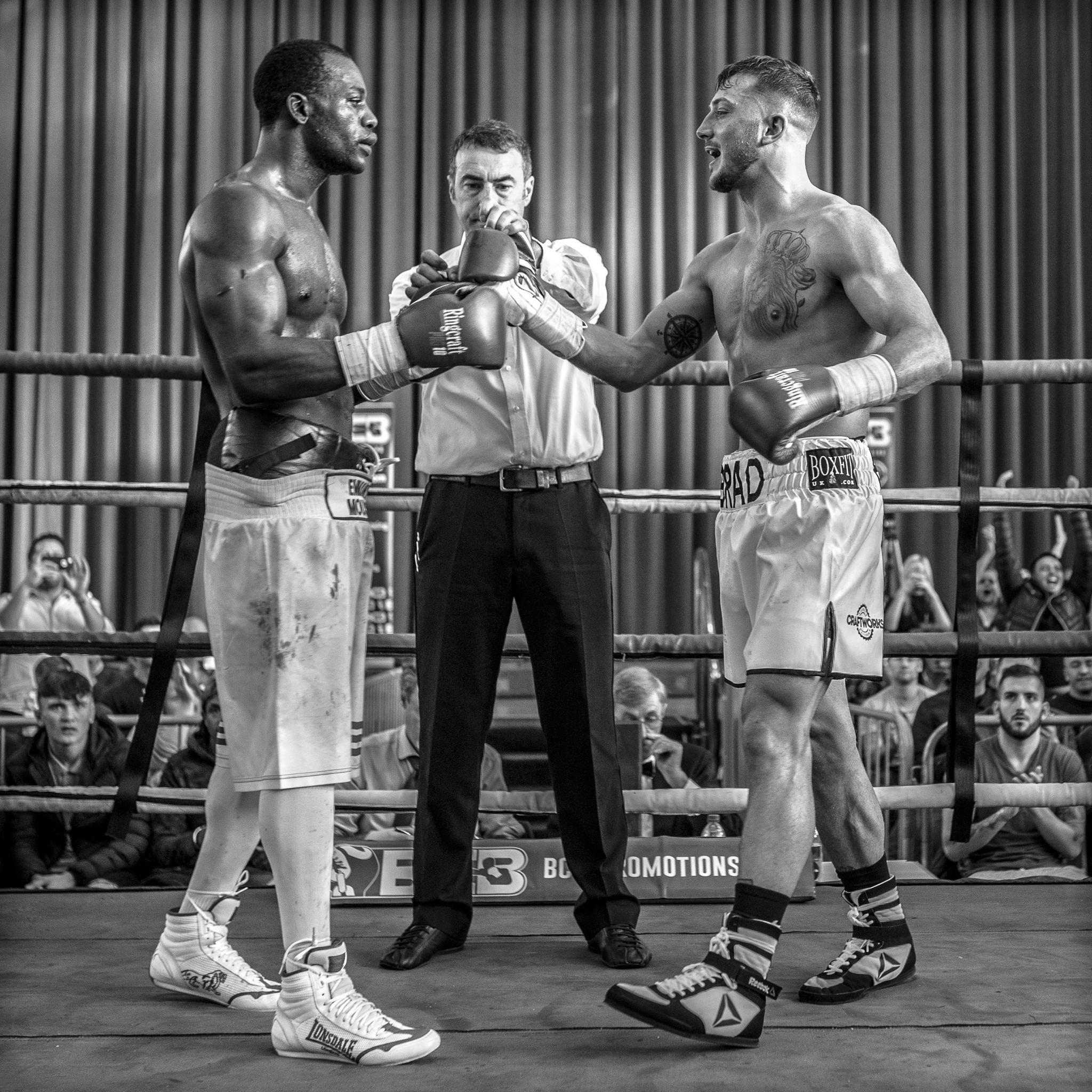 ABOVE : Even sports reportage and other live event photography can sometimes work in a square format.
You don't have to be David Bailey, Diana Arbus, or Richard Avedon to benefit from thinking inside the box once in a while.Those users of Medium Format cameras made by Bronica, Hassalblad, Mamiya, Pentacon,Yashica Mat, and Rolleiflex pioneered using formats like 6 x 6 to force you to engage with the person framed by the camera. You need not restrict yourself to monochrome studio portraits to use that same framing choice in presenting a simple but fully realised idea.
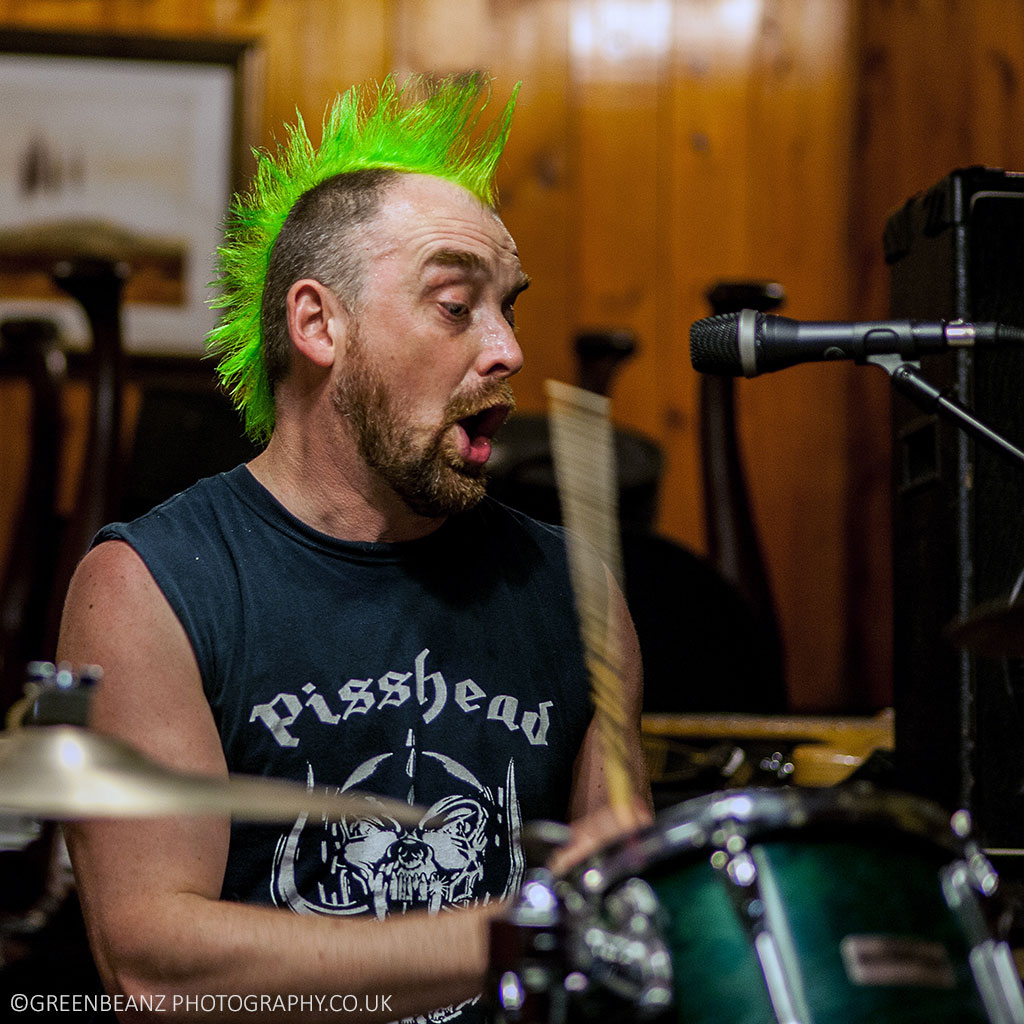 ABOVE : This image was cropped specifically for inclusion on some LP artwork. Chris is a man of many talents but here in his role as a drummer the ratio not only helps exaggerate the motion captured, but makes it a perfect option when including alongside other square portraits of bandmates for this albums artwork.
4. EXPLOIT THE VIGNETTE
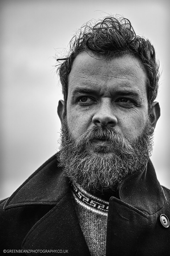 ABOVE : The vignette here really adds to the retro feel of the photograph. For an editorial portrait like this the client may want to maintian an aesthetic across a pag,e so make sure you provide two versions or discuss this stylistic decision when the brief is first agreed upon.
Framing a photograph gives it barrier to remove the distractions of anything outside of it. It is another stage of composition in itself. A vignette is an evocation, a level of artifice that fades that boundary or emphasises it and can nod towards the physical origins of the craft. It is a natural propensity and quality exhibited by lenses and sometimes it helps a photograph to not deny this origin. Vintage lenses are much more likely to exhibit pronounced vignetting ( where the edges of an image are less bright, saturated and sharp than the centre) and so it naturally evokes this retro sensibility when you include it as an editing decision for portraits.
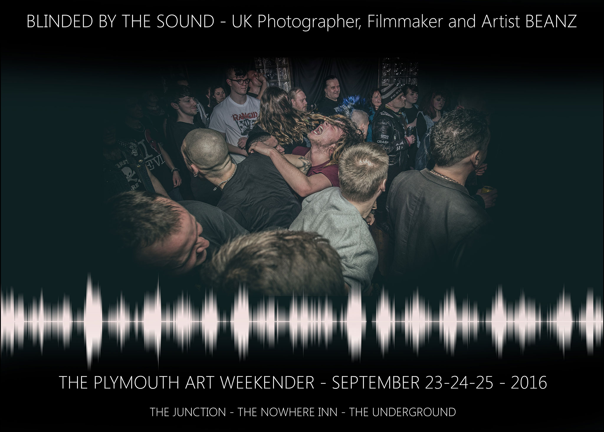 ABOVE : The extreme vignette here helps to isolate the central figure and echo the impact of the flash in what is a dark underground club. It acts like a literal spotlight focusing on the fans of scenes who are often performers themselves. For Punk Rock scenes this blurring of the division between fans and bands is central.
Vignetting actually started with painters who knew that darkened corners would help draw the eye to the subject in the centre when painting portraits, but you need not restrict it's use to images of people. The drama you can invoke by darkening, blurring or fading the edges of the frame can work in many situations.
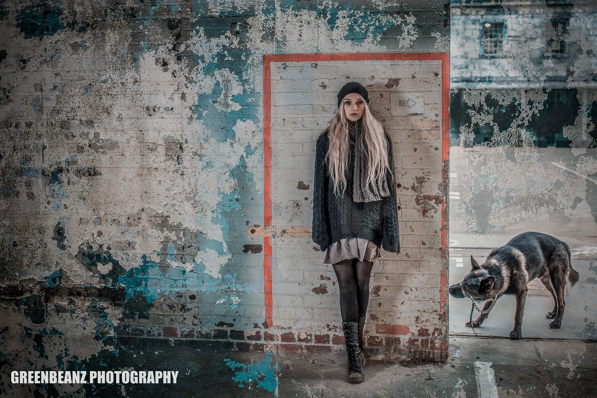 ABOVE : When shooting around the theme of winter it actually helped reinforce the theme here by having a vignette frame which created an ice block border. Even with the existing red frame around the model the vignette still helps reinforce that focus on the model.
5. BALANCE IS EVERYTHING
Perspective is important in dictating not only narrative but in providing a novel viewpoint that people are not familiar with, but balance may still dictate that you include both the earth and the sky. Balance may mean that you have an odd number of repeating objects. Balance may mean ensuring competing figures even each other out around the edges of a frame. Balance may mean balancing foreground/background, light and dark, people and landscape, but mostly balance is about removing weighty distractions that unbalance an image. Editing is literally about RE-VISIONS. The word edit comes from this association with publishing manuscripts, and it useful to remember the same principles of clarity, adding to, and not distracting from the story, and how to make an impact with text, when deciding how to edit your photographs.
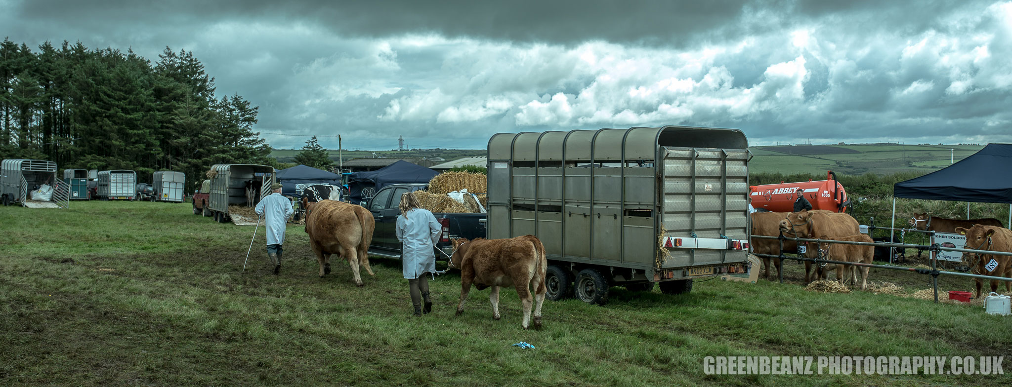 ABOVE: Balance not just the exposure but also the elements that tell the story. Not all Agricultural shows are blessed with sun and the Camelford show here is as much about the highlights breaking thru the clouds and the shadows in the centre as the practical realities behind the scenes.
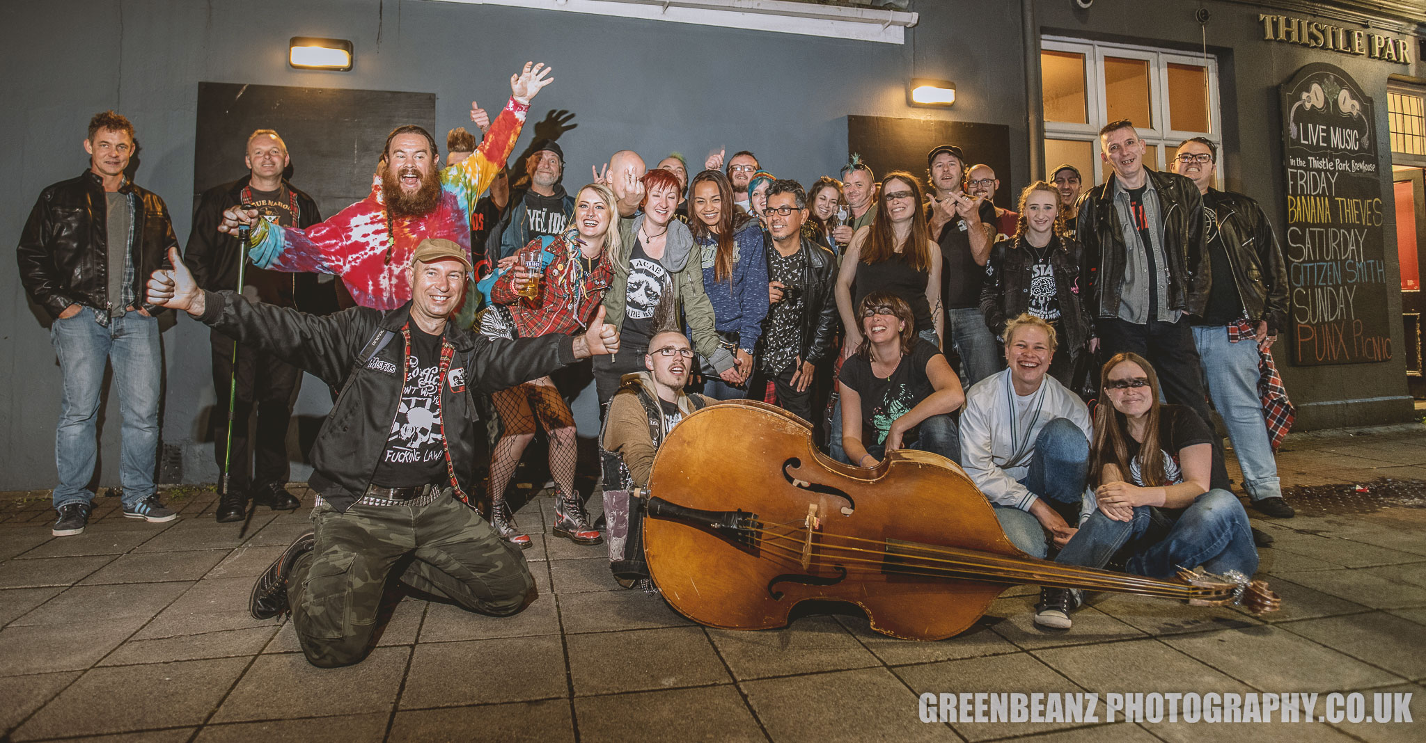 ABOVE: Careful grouping of the Punk fans here around a Double bass, still required two speedlights and a bit of tweaking in post production to make the image feel balanced.
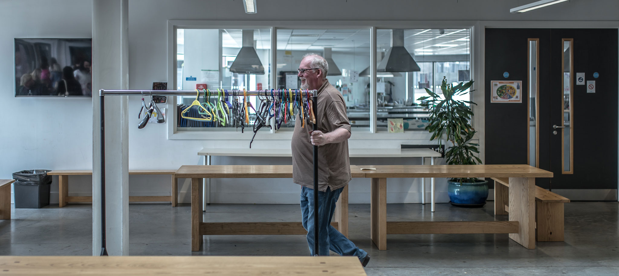 ABOVE: Keep an eye on routes when covering events as these will often provide you with people in motion to move across your frame. This is an example of edting even before you press the shutter. Anticipate the story and line up the crop before capture.
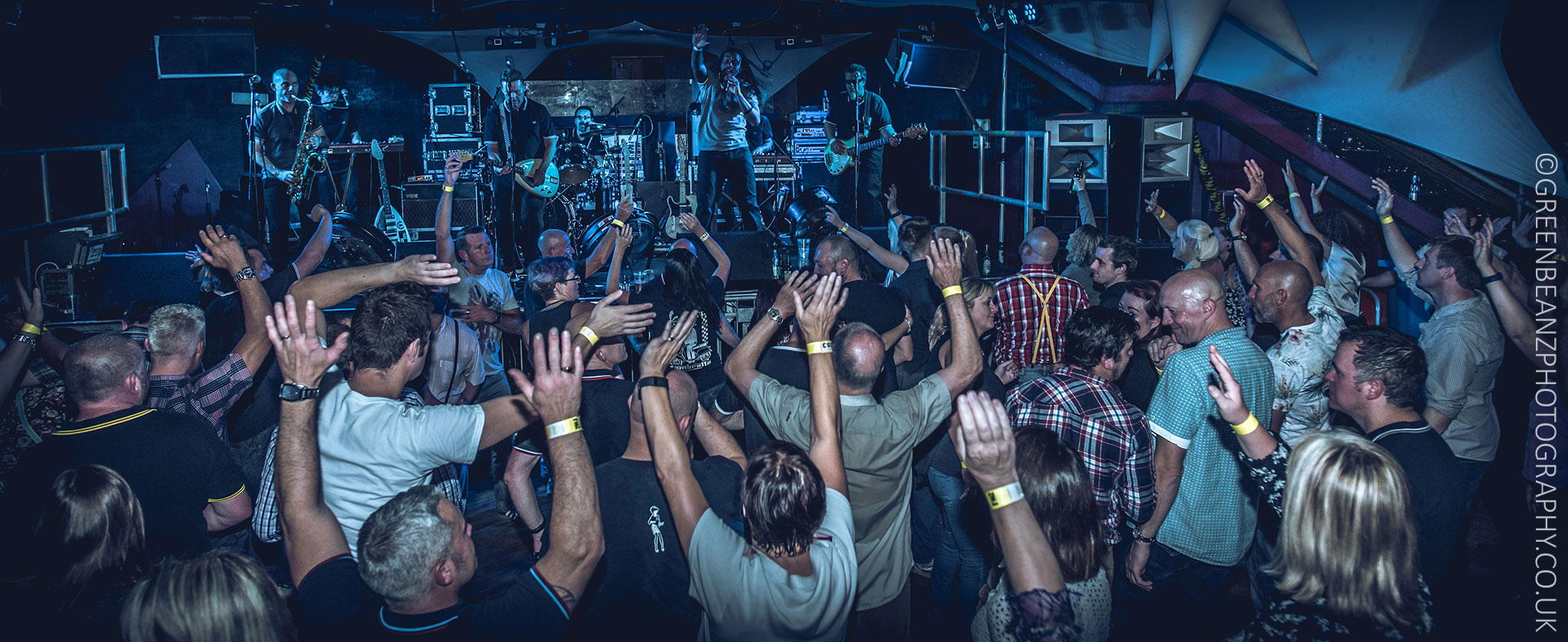 ABOVE: There are often two elements needed to balance a photograph. For gig photography the audience are as crucial as the band as these Cornish fans of The English Beat were when capturing this shot in Redruth. Without a supplemental flash it would have been almost impossible to balance the exposure in a way in which sometimes the fans are the story.
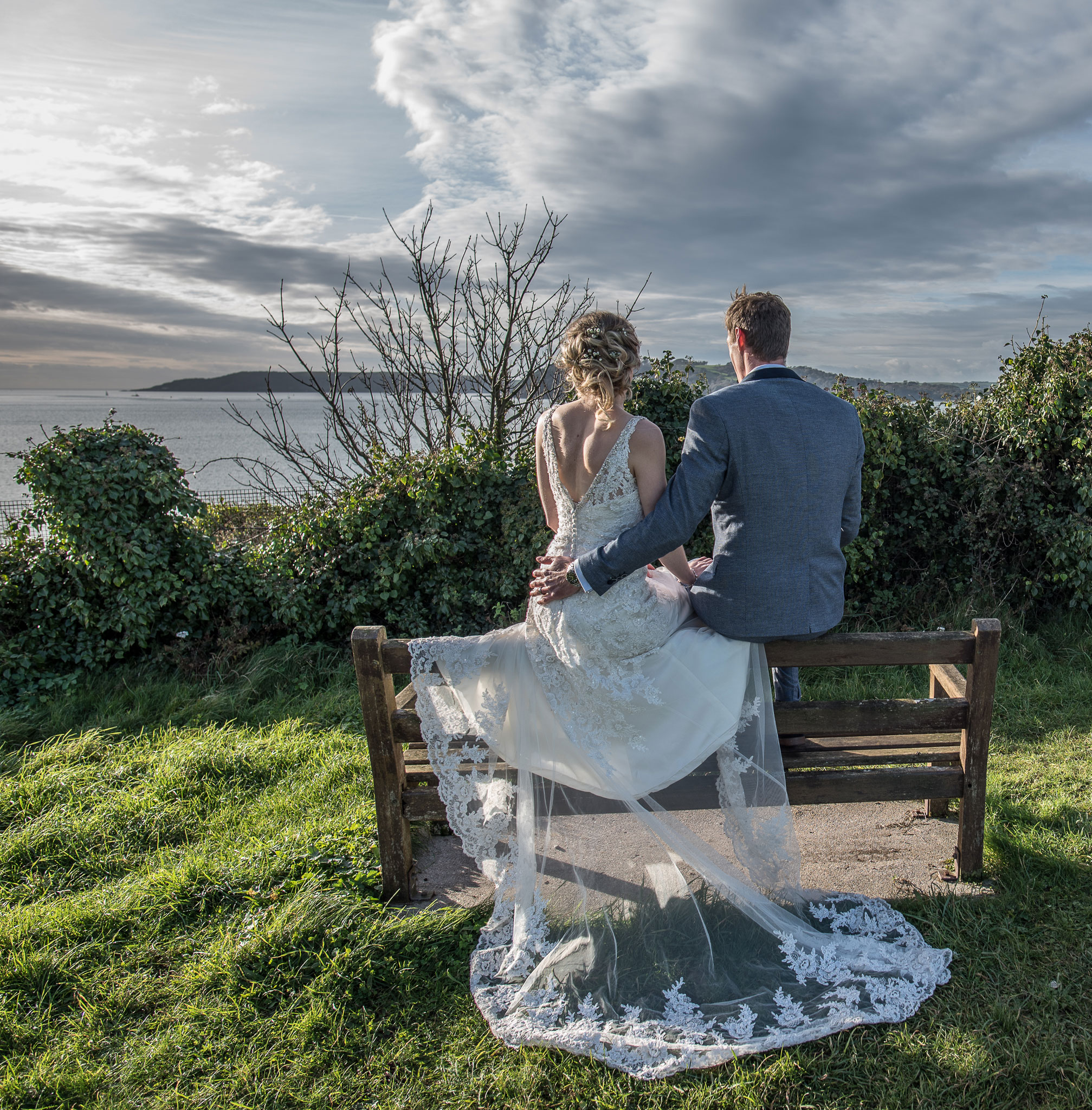 ABOVE: Showing the happy couple what they did not see. In a way that is a huge part of wedding photography on a day on which the happy couple only have eyes for each other. The edit here is not so much about the detail on the trail of the dress as providing a nice bookend to complete an album which is an 'Edition' itself.
Greenbeanz for Art Show Photography in Plymouth
Greenbeanz Photography is available to shoot your art show or event you can book here
You can find more galleries here
BLOG ARCHIVE
Two Steves Present | We're not really sure | Tavistock Wharf | June 8th - July 6th 2019
Freedom Community Festival Plymouth | 01 & 02/06/19 | Plymouth Live Music Festival Photography
Brixham Pirate Festival 2019 | 'Black Friday' Cornish Celtic Punk Rock Band | Monday 06 May 2019
Zombie Walk| Ivybridge 2017 | Photographing the undead | Photojournalism
Ophelia and Brian| Plymouth Storms| Wind and Waves across Plymouth | Photojournalism
Devcon Plymouth October 2017 | Devon and Cornwall Cosplay| UK Event Photography
Plymouth Art Weekender 2017 | Devon and Cornwall | UK Art Event Photography
Photographing Dancers 2017 | Devon and Cornwall | UK Dance Photography
Surf Photography / Devon and Cornwall Action and Sport Photography- 06/09/17
Photographing Animals / Devon and Cornwall Animal Photography- 01/09/17
Photographing Horses / Devon and Cornwall Equine Photography- 09/08/17
Camelford Agricultural Show 2017- 09/08/17
Summer Sizzler 2 - UK PRO Boxing in Plymouth -29/07/17
Punks 'n' Pirates 2017- The Cleaners and The Bus Station Loonies- 24/06/17
Event Photography in Plymouth - 23/05/17
Photographing bands in the recording studio- Black Friday at dBs Music Plymouth - 20/05/17
Take Back Control Plymouth-Point of View and Event Photography- 13/05/17
Mayhem! -Plymouth Boxing Mayhem! Weigh In- 06/05/17
Look Up -Photographing Clouds in Plymouth - 29- 30 April 2017
St George's Day -Ocean City Half Marathon / Morris Dance - 23/04/17
The Robin -The Photographers Friend - 03/01/17
Headshots and More-The Tanglewood Practice- 14/11/16
Stanley the English Bull Terrier on Plymouth Hoe-Bonfire Night -05/11/16
Movement -Shoot with Kevin French -25/10/16
Forked at the Barbican B Bar-Jemima Foxtrot -19/09/2015
